Carefully researched, clearly laid out, and free to access. Guides that support doctors in the emergency department.
By doctors. For doctors.
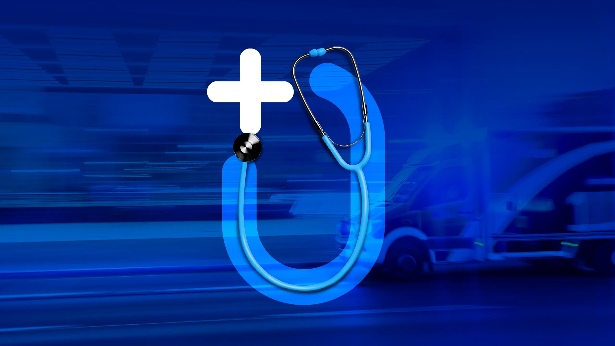
By doctors. For doctors.
01 Context
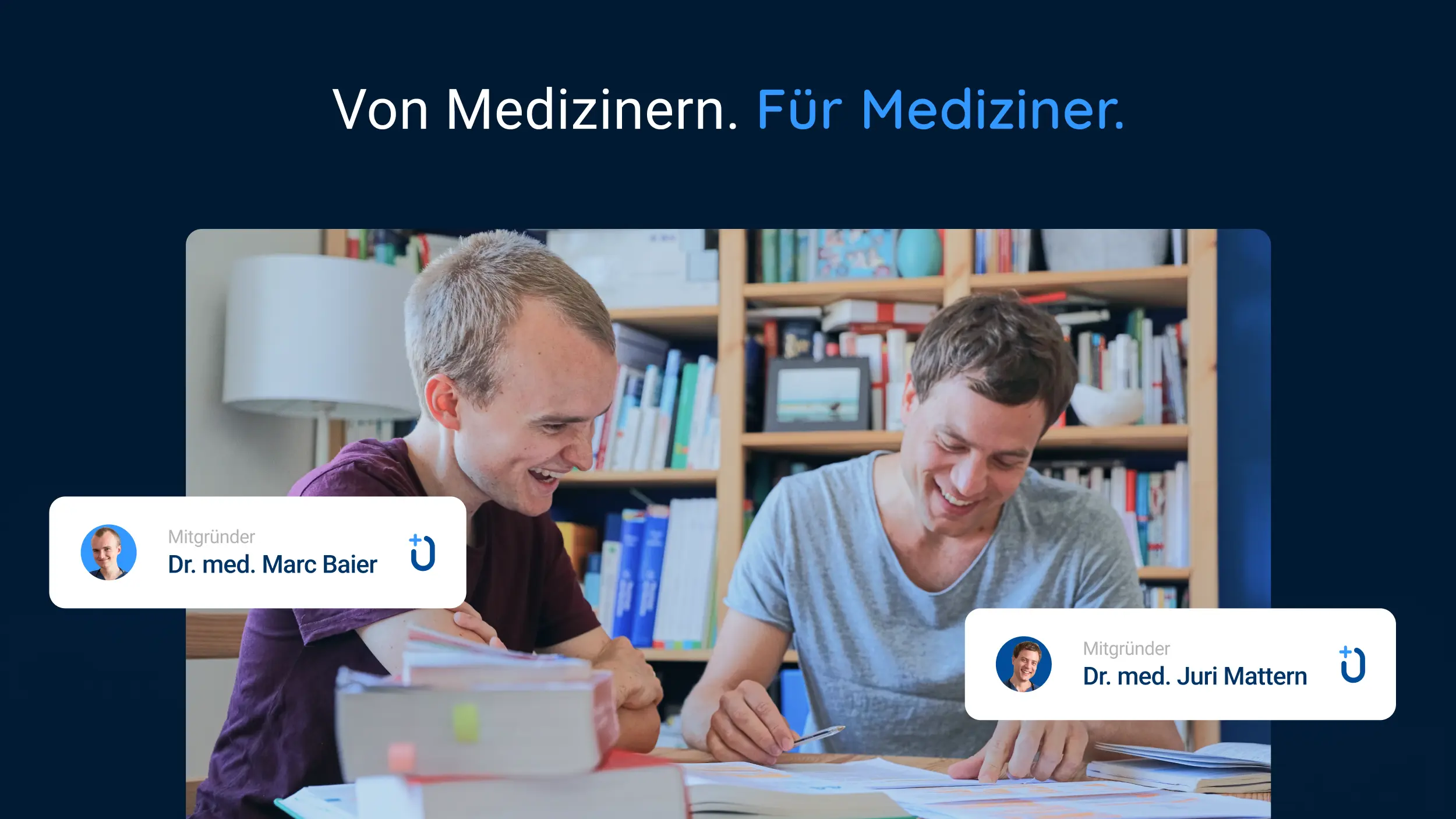
Doctors in acute and emergency departments are often exposed to extreme situations in their daily work. With time as the critical factor, a bold, fast and structured approach is often decisive. The vision of two young specialists: a platform that gathers schematised guides ("Standard Operating Procedures"). Guides that help medical staff keep an overview, including in more complex cases. For that they needed a visual and functional scheme with room to grow, that makes recurring content recognisable across the set, and that the two doctors can apply themselves.
02 Method
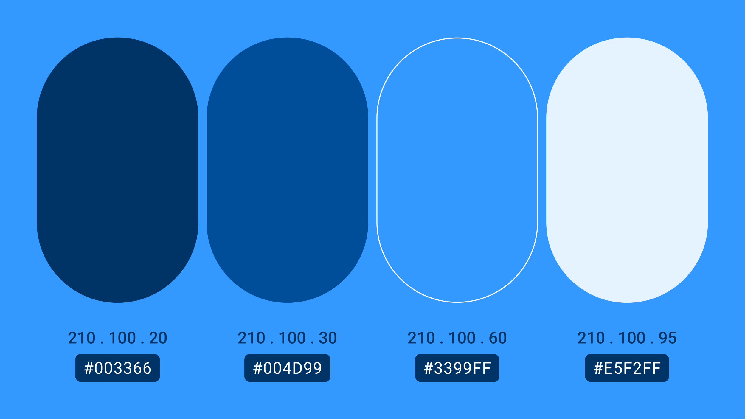
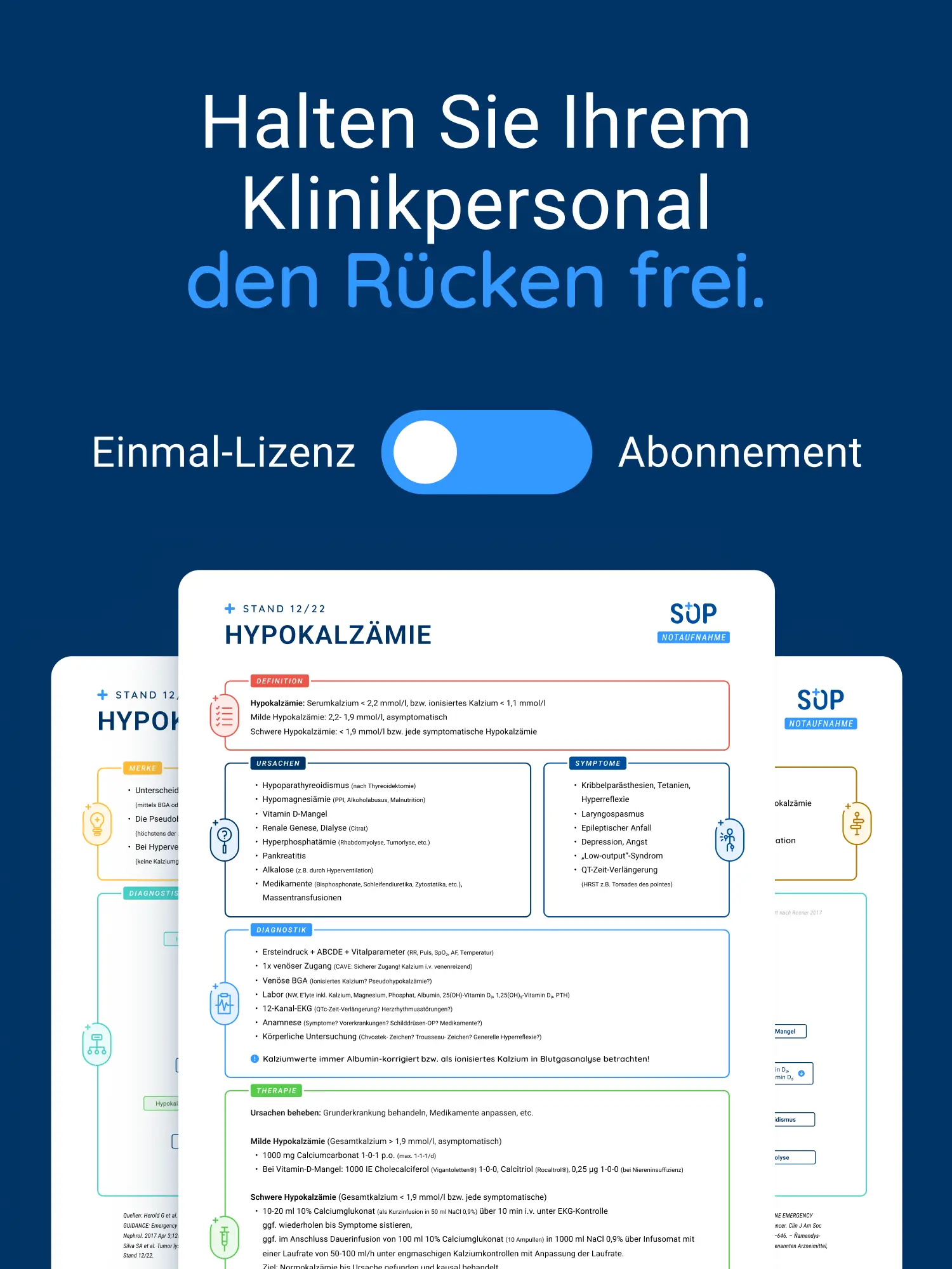
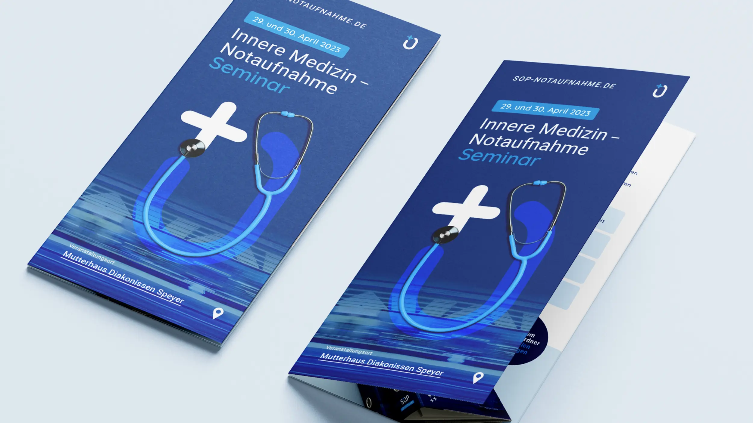
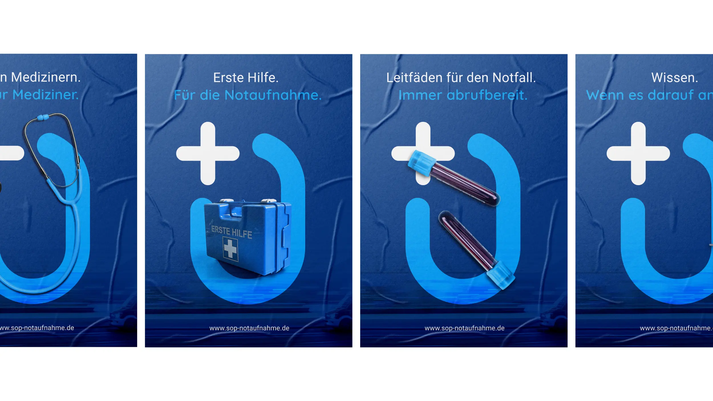
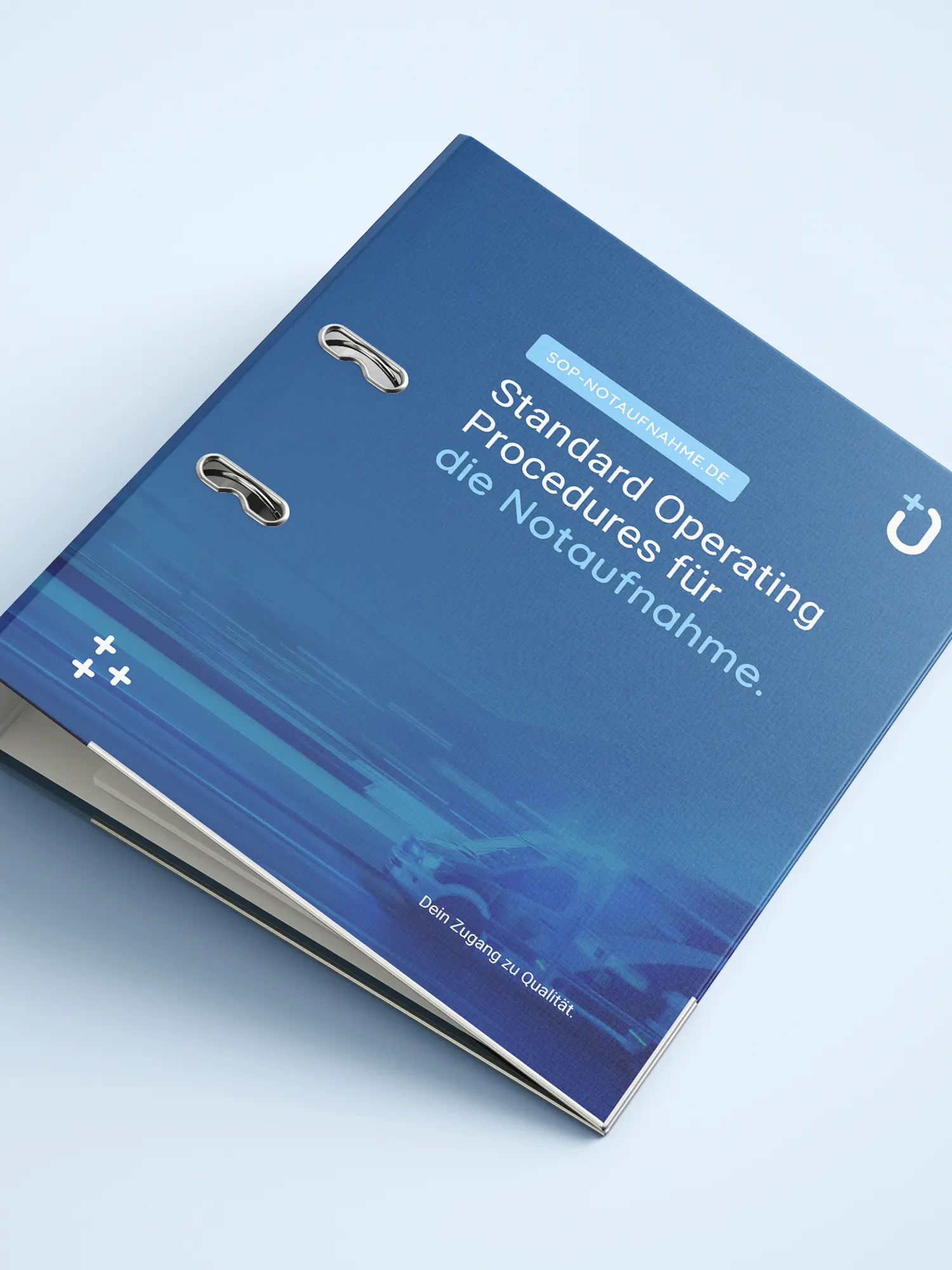
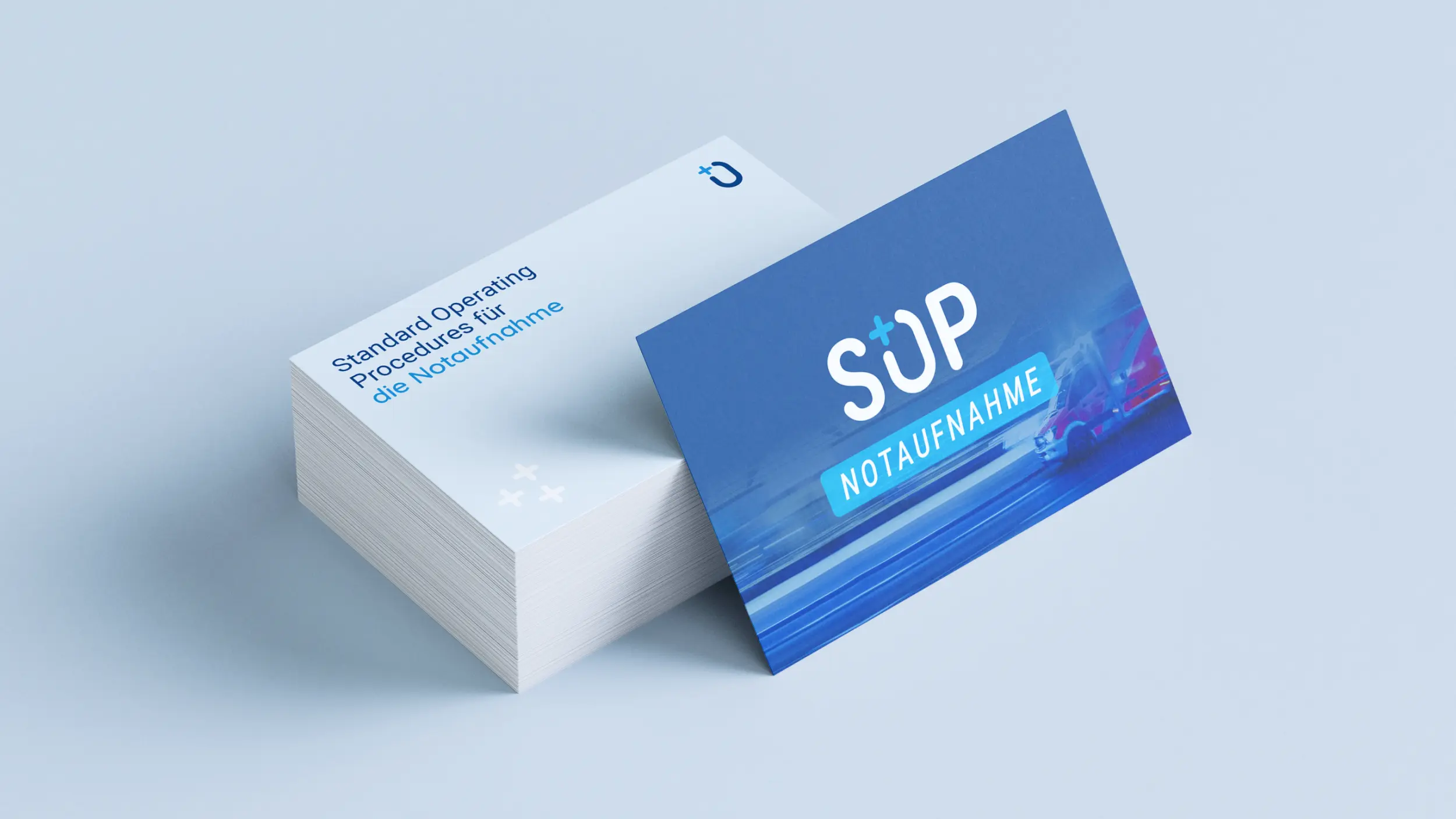
Relevant conditions, compressed onto a few pages in the same scheme every time: a colour system for grasping information fast, concrete action steps, and recommendations for dosing and discharge. SOP Notaufnahme stands equally for professionalism, competence and precision, and for approachability and access. A friendly, characteristic display font with a helpful character supports that, while the suggested stethoscope in the logo clearly places the brand in a medical context.
03 Result
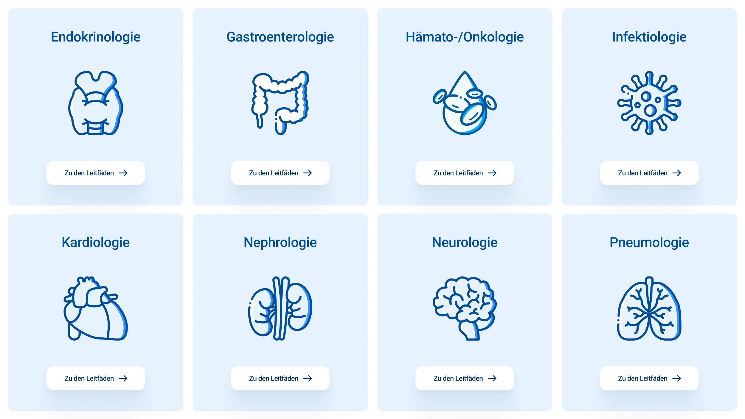
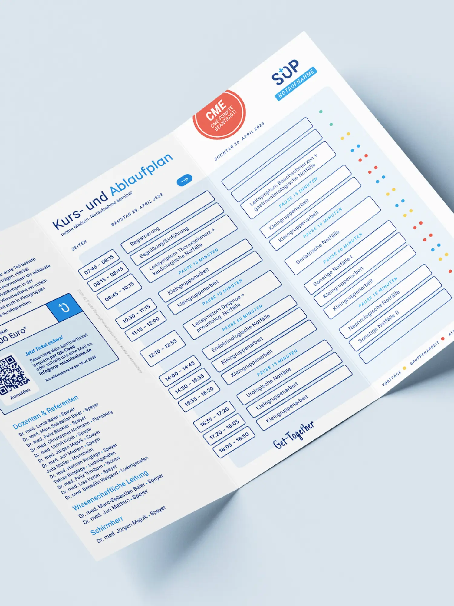
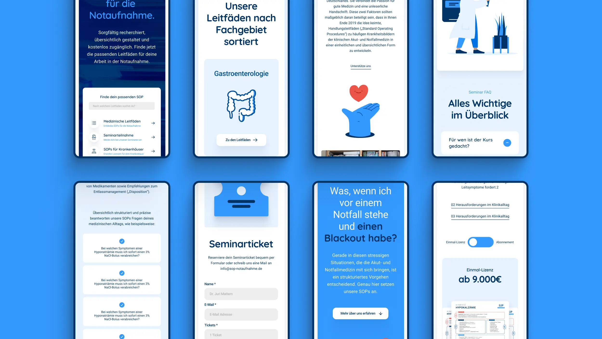
Clarity, not only on the users' side. Instead of seeing ourselves as a pure design supplier, we put the value creation in the client's hands. The framework that came out of that now lets the doctors extend the information offer themselves. Thanks to the extended search on the revised website, the SOPs are even faster to hand. Meanwhile the reduced iconography and clear colour create more overview and simple orientation. With our sustainable approach in framework and design we made room for future extensions, and have already added analogue fields such as fairs and seminars to the brand.
Client
SOP Notaufnahme
Industry
Release
Team


Book a call
01 Context
Doctors in acute and emergency departments are often exposed to extreme situations in their daily work. With time as the critical factor, a bold, fast and structured approach is often decisive. The vision of two young specialists: a platform that gathers schematised guides ("Standard Operating Procedures"). Guides that help medical staff keep an overview, including in more complex cases. For that they needed a visual and functional scheme with room to grow, that makes recurring content recognisable across the set, and that the two doctors can apply themselves.
02 Method
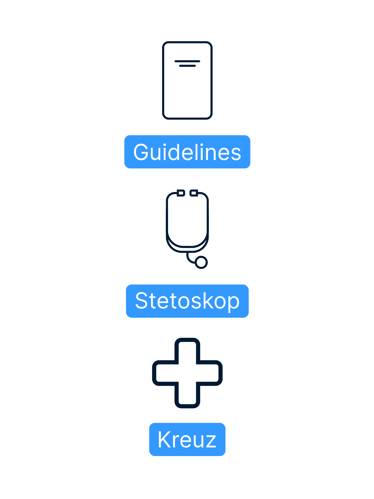
Relevant conditions, compressed onto a few pages in the same scheme every time: a colour system for grasping information fast, concrete action steps, and recommendations for dosing and discharge. SOP Notaufnahme stands equally for professionalism, competence and precision, and for approachability and access. A friendly, characteristic display font with a helpful character supports that, while the suggested stethoscope in the logo clearly places the brand in a medical context.
03 Result
Clarity, not only on the users' side. Instead of seeing ourselves as a pure design supplier, we put the value creation in the client's hands. The framework that came out of that now lets the doctors extend the information offer themselves. Thanks to the extended search on the revised website, the SOPs are even faster to hand. Meanwhile the reduced iconography and clear colour create more overview and simple orientation. With our sustainable approach in framework and design we made room for future extensions, and have already added analogue fields such as fairs and seminars to the brand.
Client
SOP Notaufnahme
Industry
Release
Team
Book a call
Not enough? Ask your AI about us
Let's find out if we're a fit.
Let’s get to know each other and see whether we’re the right fit for your project. From there, we can shape a solution around what you actually need.
Tuesday, September 29, 2026
1
2
3
4
5
6
7
8
9
10
11
12
13
14
15
16
17
18
19
20
21
22
23
24
25
26
27
28
29
30
31
10:30
11:30
14:30
15:30
16:30
17:30
Let's find out if we're a fit.
Let’s get to know each other and see whether we’re the right fit for your project. From there, we can shape a solution around what you actually need.
Tuesday, September 29, 2026
1
2
3
4
5
6
7
8
9
10
11
12
13
14
15
16
17
18
19
20
21
22
23
24
25
26
27
28
29
30
31
10:30
11:30
14:30
15:30
16:30
17:30